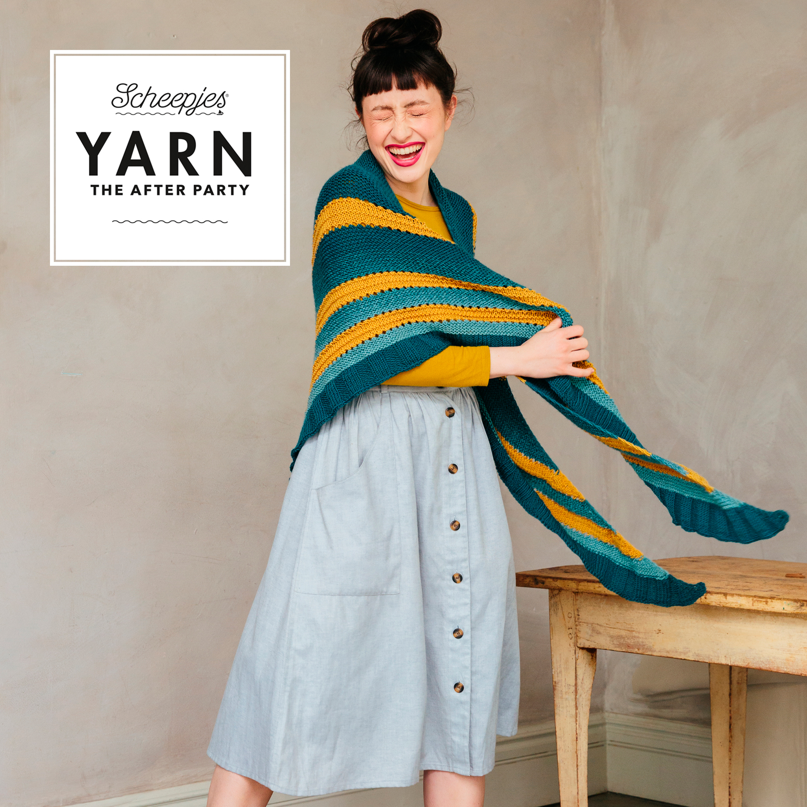
In my previous blog post, I wrote about the Shawl for Adventures that I was allowed to design for Scheepjes. For the original pattern, I chose a combination of teal and mustard yellow. I also showed you that I made another version for myself, combining blue with a rusty colour. In this post, I want to show you 7 different colour combinations (and a few variations) that give the shawl a completely different look every time.
Colour and Personal Preference
Choosing a colour is a very personal choice. On the one hand, there is your personal preference: which colours do you actually like? Do you like bright colours or are a bit more muted colours more to your taste? Maybe you prefer warm colours to colder hues.
On the other hand, it is good to make sure that you choose colours that suit you and enhance you. You may like pink, but that does not mean that it looks good on you as well. Whether a colour suits you depends on your skin tone, eye colour and hair colour. For example, pastel colours do not suit me very well, they make me look pale. Dark colours and jewel tones are better for me. But that can be completely different for you.
So colour is a very personal thing.
Colour in the Design Process
During the design of a pattern, I make many choices as a designer. What do I want to design? What technique do I want to use? What shape should the end product have? Which stitches or stitch patterns do I want to use? And, what colours do I choose for the sample?
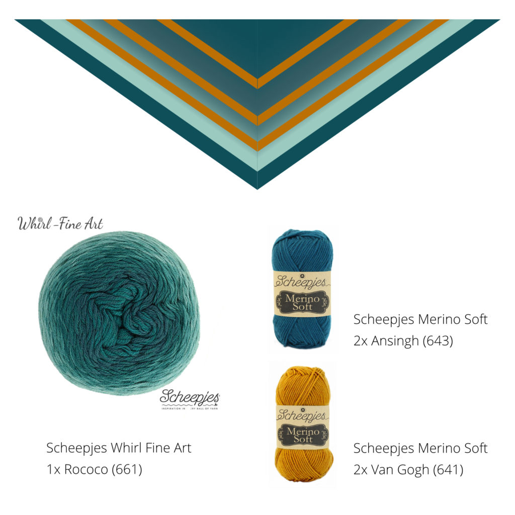
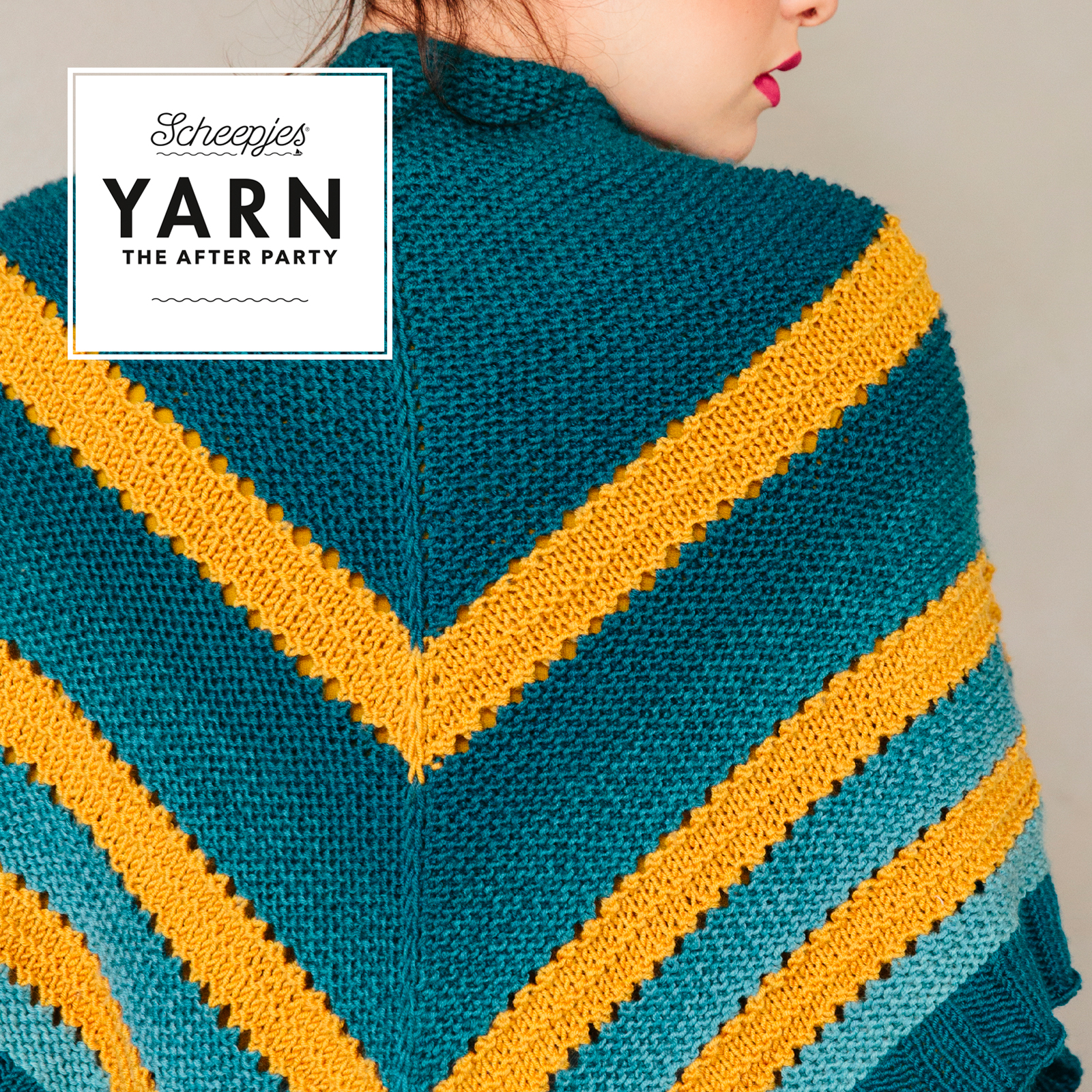
For the sample of the Shawl for Adventures, I chose a Scheepjes Whirl Fine Art in the colour Rococo (number 661). This Whirl runs from dark to light teal from the inside out. This gradient is used in the shawl as well, but it is interrupted by an accent in texture and an accent in colour. For the accent colour, I chose the mustard yellow colour Van Gogh (Scheepjes Merino Soft, number 641). For the edge of the shawl, I went back to the beginning, to the dark part of the Whirl. The matching colour of Merino Soft is Ansingh (643) and I used it for the border.
My own Shawl for Adventures
In the previous blog post, I showed you my own version of the Shawl for Adventures. I did choose the colours for the original version and I really like that version too. Still, it is not the combination of colours that I would wear myself. That’s the fun part of designing by the way: you can go totally out of your comfort zone!

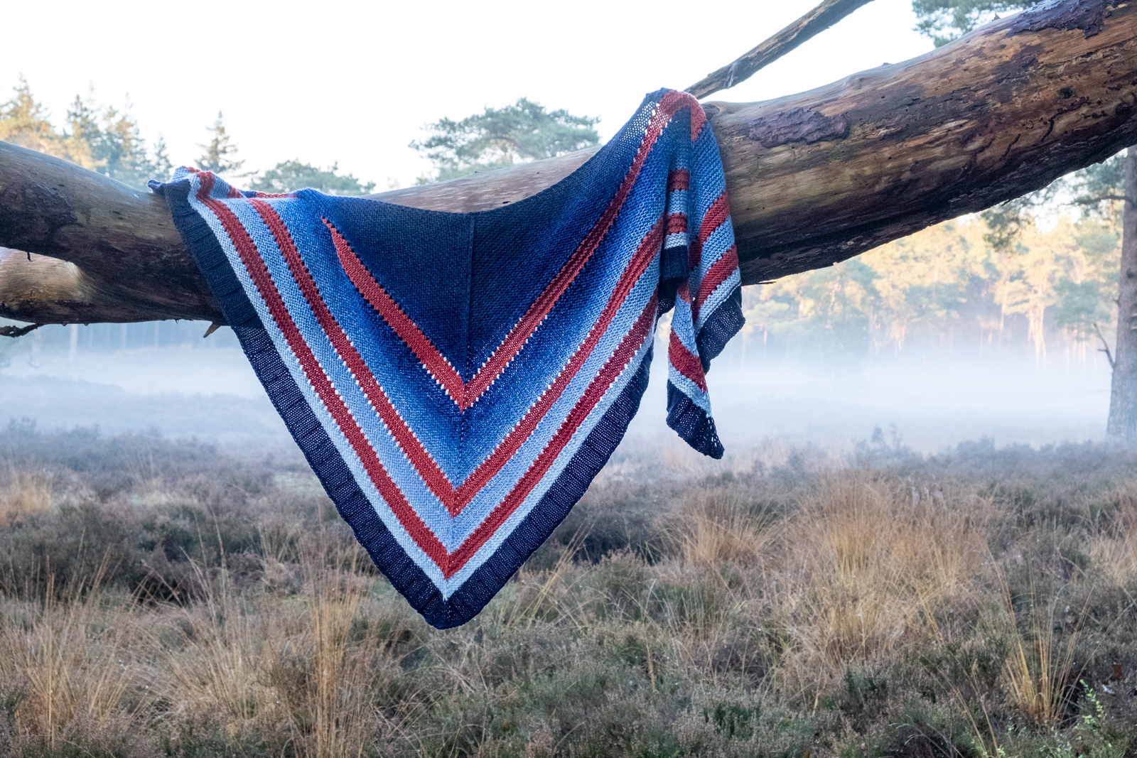
Because I love the Shawl for Adventures pattern so much, I decided to make one for myself too. In my wardrobe at the moment, you’ll find a lot of clothes in dark blue and caramel, with or without stripes. So for my own shawl, I chose Whirl Fine Art in Classicism (658) and used Merino Soft Dalí (608) as the accent colour. I knitted the border with the colour Wood (618) which matches the dark centre colour of the Whirl.
5 More Combinations
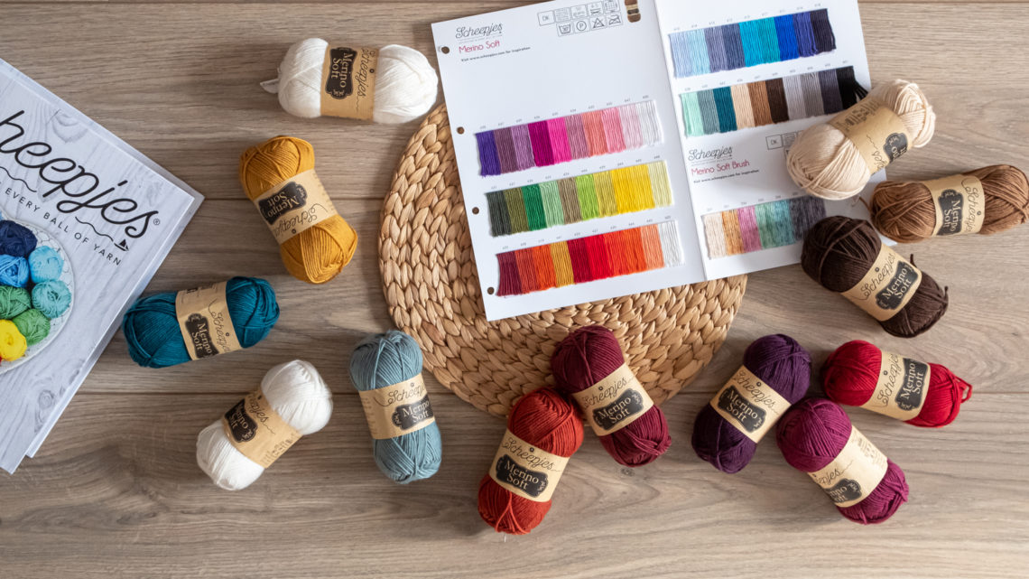
I would like to give you some more inspiration for your own Shawl for Adventures. This is why I made some more different colour combinations and added a few variations to them. From neutral tones to bright colours. For all colour schemes, I used Scheepjes Merino Soft, either combined with a matching Whirl Fine Art or not.
1. Monochrome (with a Colour Pop)
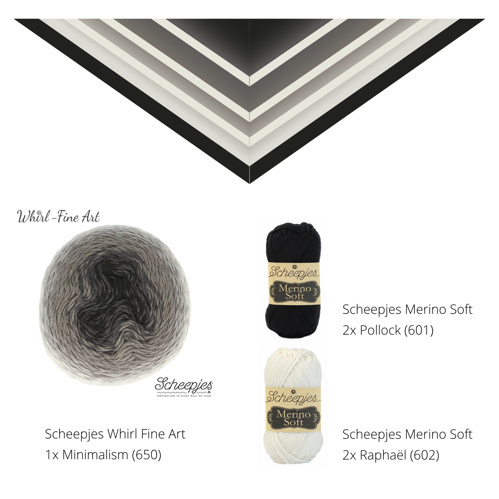
Let’s start with a very basic colour combination: black and white! Timeless and classy.
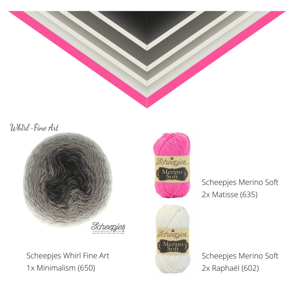
How about monochrome with a splash of colour on the border? For this example, I picked pink but there are a ton of options to add colour to black and white.
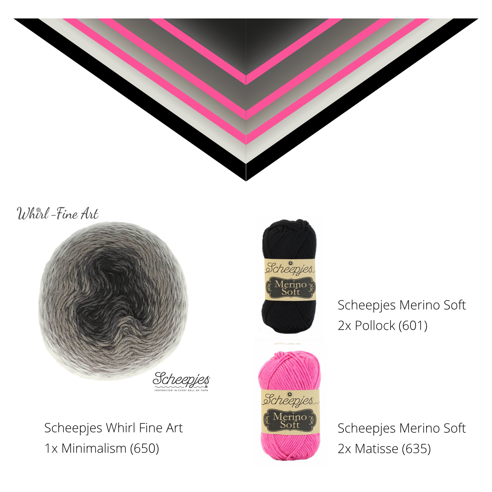
Another way to add a pop of colour to a black and white version of the Shawl for Adventures is to use a bright accent colour for the stripes.
Do you see how different those two last versions look just by switching two colours?
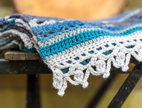
2. For the Lovers of Green
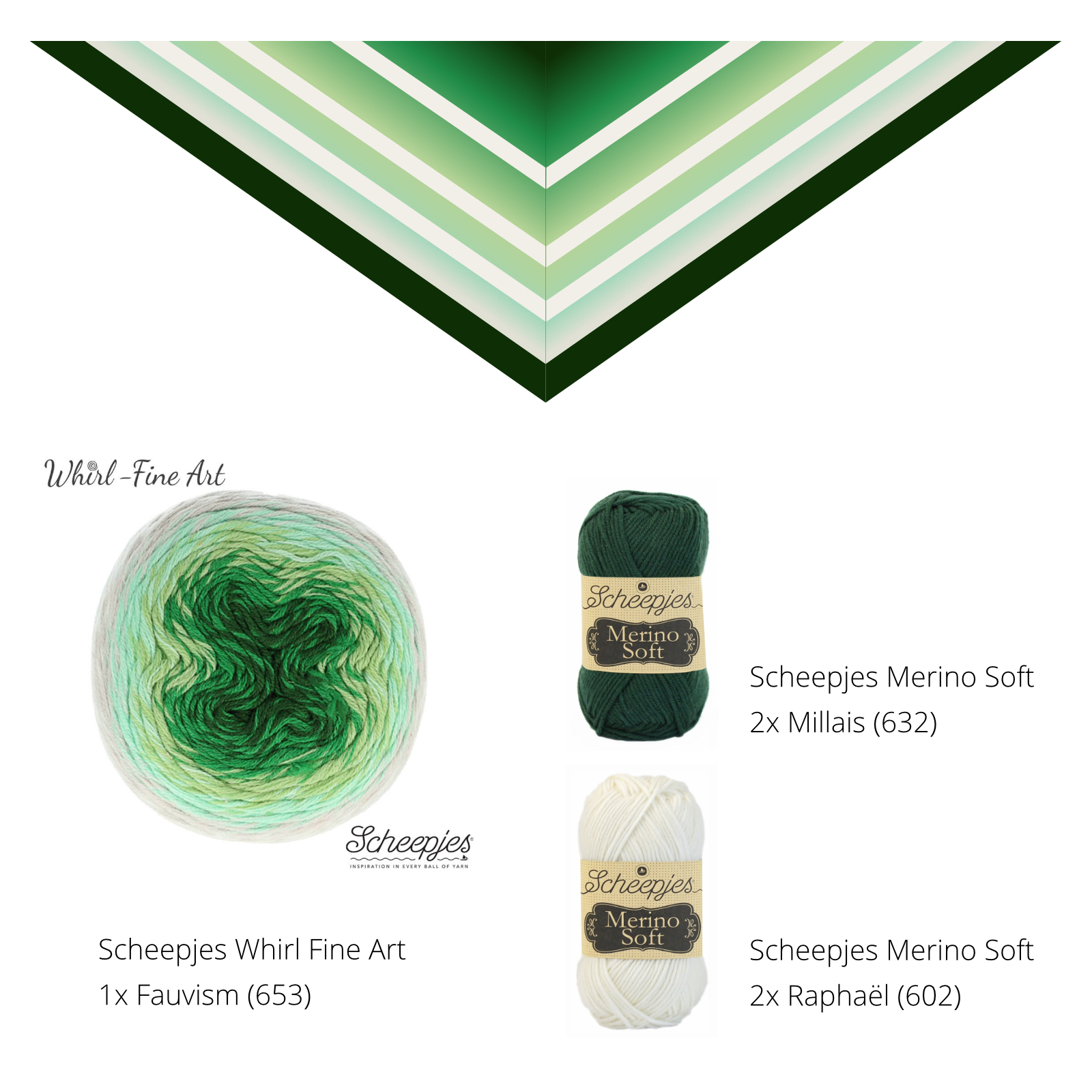
The Fauvism colourway of the Whirl Fine Art starts with very deep green on the inside and through various shades of green and mint, it ends with an almost white on the outside.
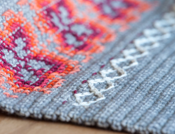
3. Pink and Golden Colours
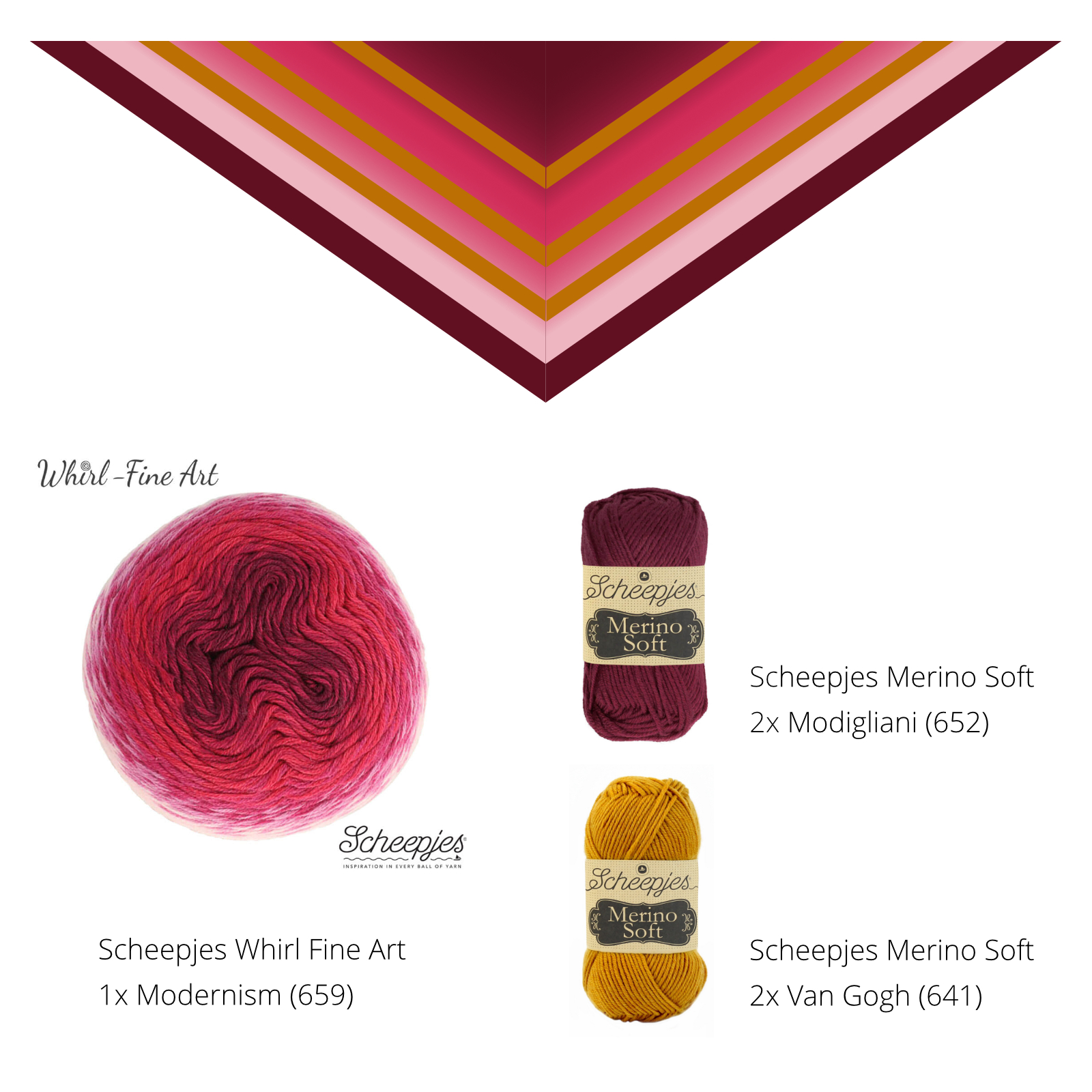
I have to admit that, after playing with all these colour swatches, this is one of my favourites! I like the warm and dark centre of the Whirl. The very bright pinks are muted a bit by the golden stripes.
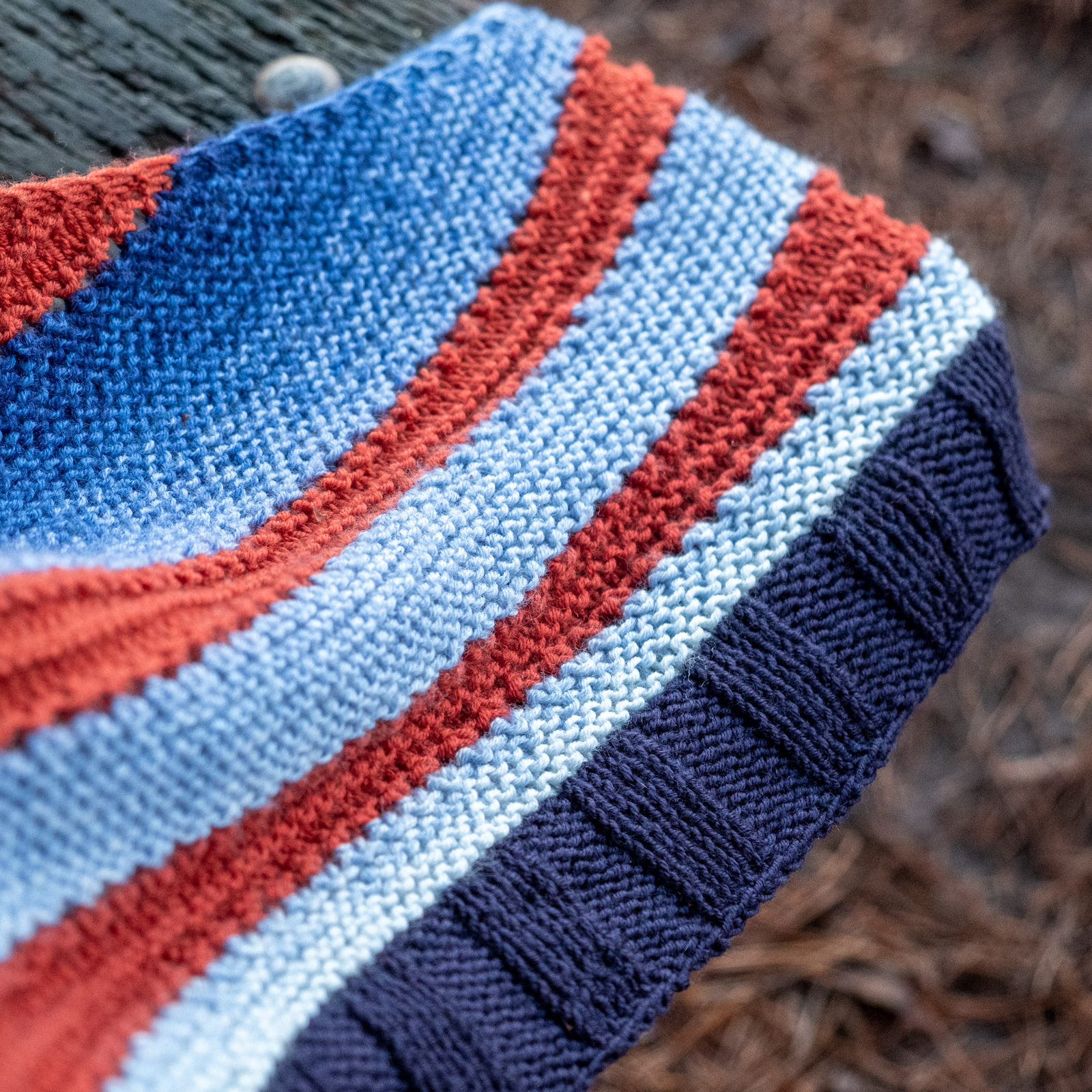
4. The Nautical Look
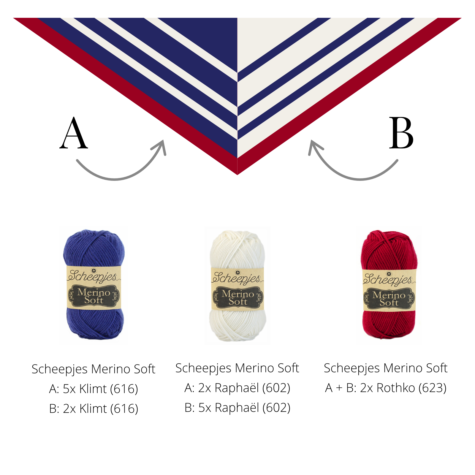
Blue and white combined with red is a classic combination and makes its appearance in fashion over and over again. You could either choose to use blue as a base and add white stripes. In the picture above, that is version A on the left. Or the other way around and add blue stripes to a white base. That is version B on the right. On both of them, a red border emphasizes the nautical feeling.
There is a third option here: You can knit the shawl as I show it in the picture above. So a blue background on half of the shawl and a white background on the other half. In order to create this effect, you would need four balls each of blue and white and you could use the intarsia technique to switch colours at the centre spine of the shawl.
5. Retro Maybe?
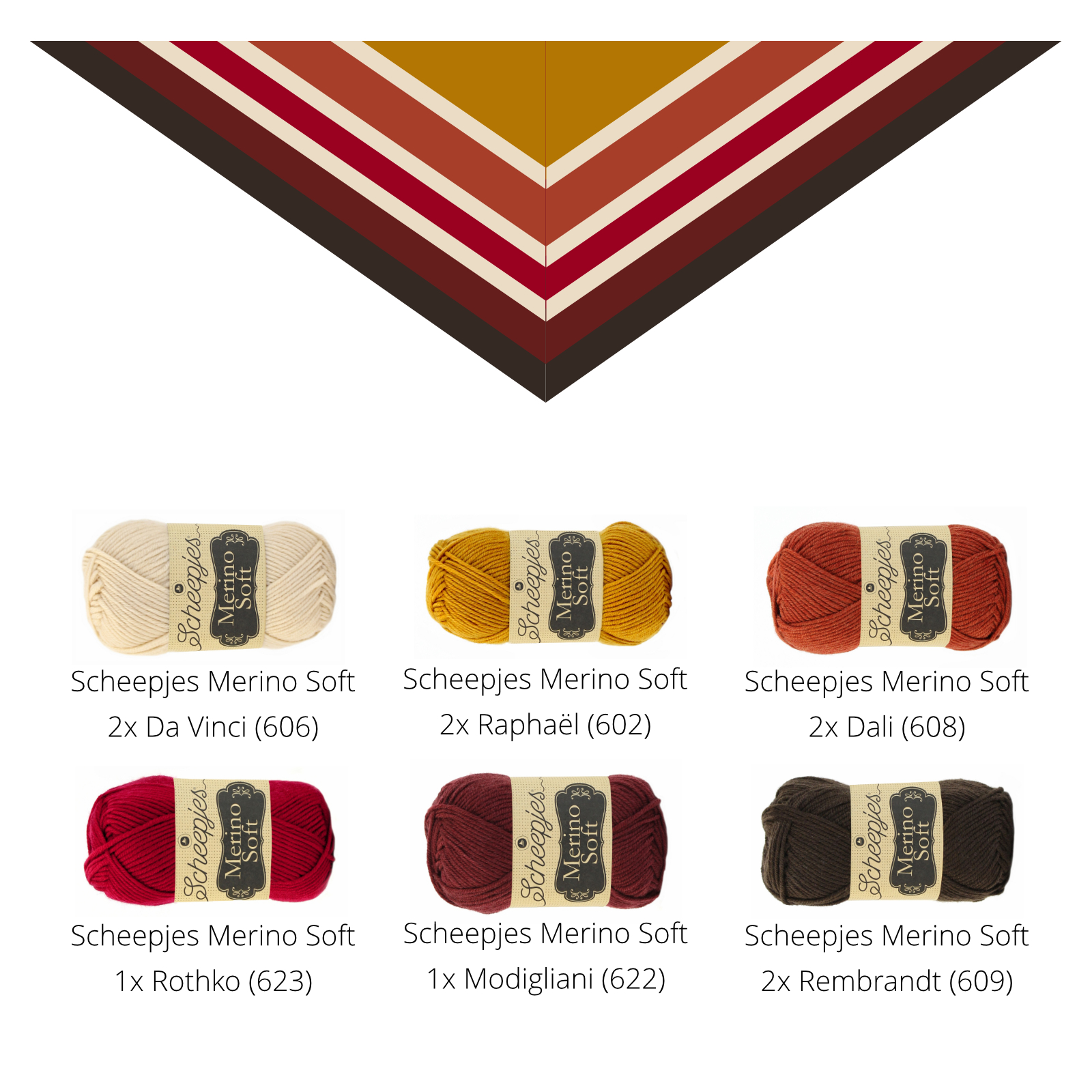
The colour range of Scheepjes Merino Soft covers some beautiful warm oranges and browns and I used some of them for this retro version of the Shawl for Adventures. This is definitely another one of my personal favourites!
Can You Choose?
I had a lot of fun creating these digital shawl examples!
Of course, there are many more possibilities to combine colours. On the website of Scheepjes, you can find an overview of the matching colours Merino Soft and Whirl Fine Art. This can help you to choose your own combination.
Did you find a colour combination you would like to use for the Shawl for Adventures?

No Comments